Make Gimp great again!
I like Gimp. Or, I used to like Gimp. Whenever I had to install on a fresh machine, I had to look for an old version (2.6.x). I really can't stand some of the changes in the latest versions. Needless to say, when I saw 2.10 for the first time, I kind of gave up and started looking for something else. (Paint .Net, Krita, Photoshop...)
At some point though, I decided to give Gimp another try, and see if was possible to configure the editor back to a usable state.
Eeek!
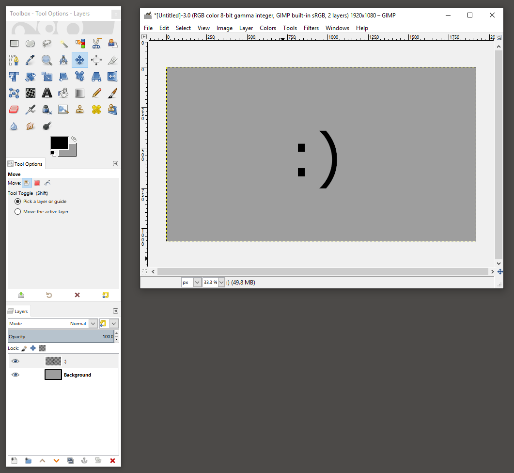
Step 1: Release the windows
At first, old Gimp may feel strange, but keeping the images in different windows actually makes sense. And, when you are used to it, you don't want to go back. I usually have multiple windows opened, with different sizes. Copy/pasting between windows is so much smoother.
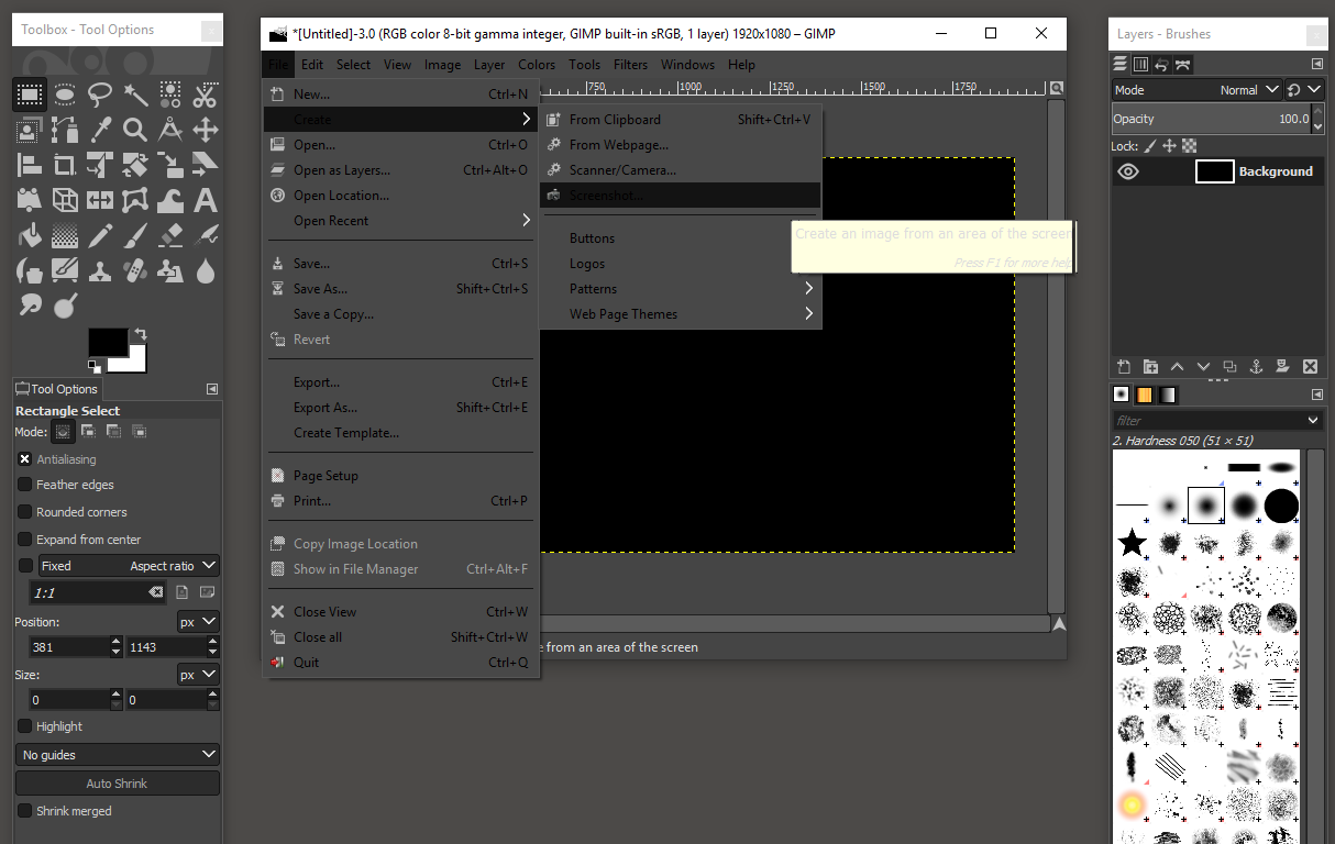
Anyway, I found the setting! Just uncheck Windows/Single-window Mode.
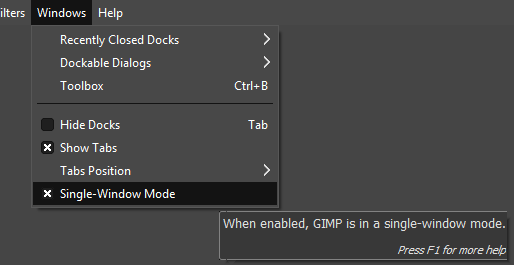
Release the windows
Step 2: Fix that color scheme
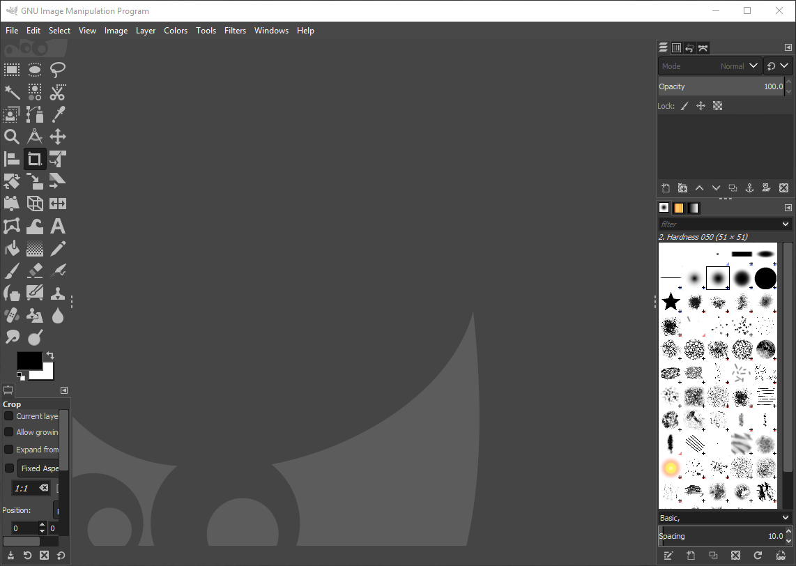
Ok, I know Adobe switched to this dark theme thing ages ago, but seriously! It may make sense if you want to have some kind of dark room feeling, but then you can't have these bright white areas where the background is highlighted - instead of the stuff you actually want to see. And what about readability? Gray on gray on gray... lovely! - NOT!
Readability?
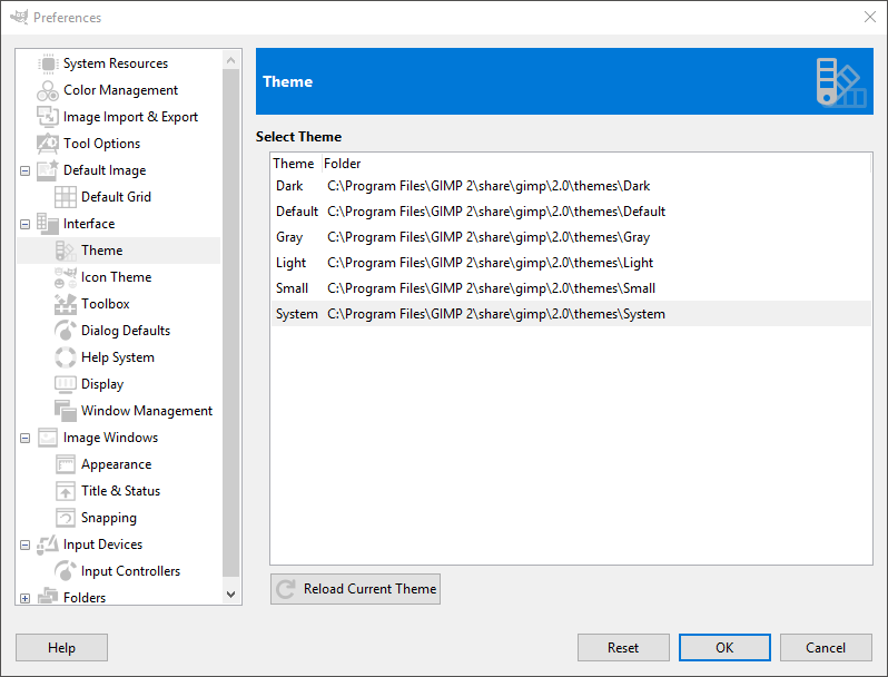
Luckily, the old color scheme is still included. Just go to Preferences/Interface/Theme and select system, and we are almost there!
Fix that color scheme
Step 3: Colored icons
Sure, you get prettier screenshots, but I am more interested in actually using the program. Microsoft tried it in Visual Studio, but brought back the colored icons in 2017. The colors add a dimension, helping you to quickly find the right tool.
Luckily, you can select the old "Legacy" icons at Preferences/Interface/Icon Theme
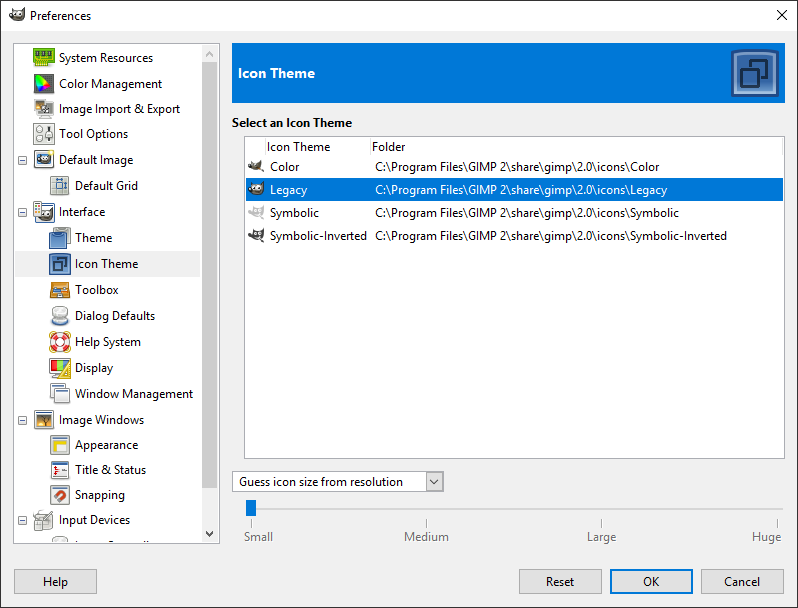
Bring back the icons
And that's it. Just re-organize the windows, and you are home again! :)
Done!